MacMag39 — online


     Three years ago, MacMag39 was launched, selling 800 copies worldwide and getting featured with the likes of Archdaily, Dezeen and Archinect. Now, by popular demand, it can be also read online.

The experience of reading on a screen is inevitably different from that of reading a physical book. This digital-analogue relationship is one of key topics of the publication itself, so I am not going to expand on that, and will only point out that the translucent sheets have been excluded from the digital copy — they were deliberately designed as an analogue-only experience, and do not translate online. The only way to experience (imagine?) this effect on screen is by checking out the photos of the printed publication, available here.


The huge advantage of the digital, however, is the ability to reach a much wider audience, fast. The digital version of MacMag39 had a soft launch earlier this year, and was originally only shared with those who requested to read the book after all the physical copies were gone. Between those who requested, and those who stumbled on it via issuu suggestions, the book was read over 800 times — surpassing the number of physical copies out in the world. Now that it has been embedded on this blog, the number of readers is probably going to grow at an ever faster rate, reaching even further corners of the world. Like this, MacMag39 continues to live — online.


MacMag as a series of publications by independent Editor teams continues to thrive as well — the latest issue, MacMag42, has just been launched and, unless they already sold out, is available at the GSofA Degree Show. Go get yours before they're all gone, and spread the MacMag love!


A Year in London


Time flies. Especially when you're torn between recovering from an exhausting Thesis year; finishing your student life and starting off as a young professional; moving cities (and all your belongings); finding a home within the exciting housing shortage of London; and joining a young, ambitious Architecture studio with a lot of work. It's no wonder I've completely abandoned social media and this blog for a whole year — since my London adventures began.

Now that I've settled — quite amazingly, just a 20-minute walk away from where I work (an unheard-of luxury in London!) — it feels like a good time to re-start the blog with a short summary of what I've been up to since I joined Coffey Architects.

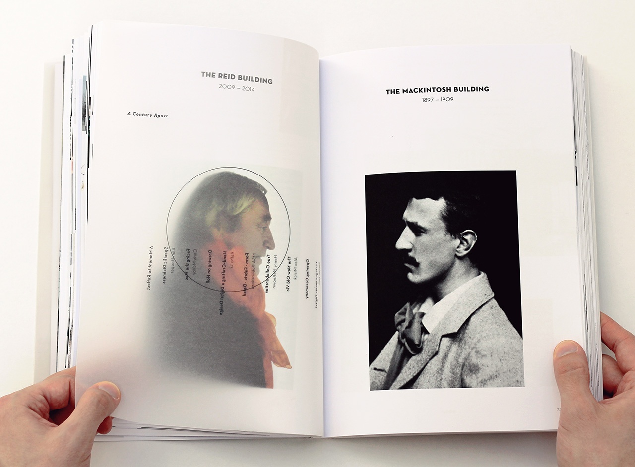
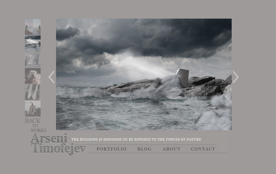
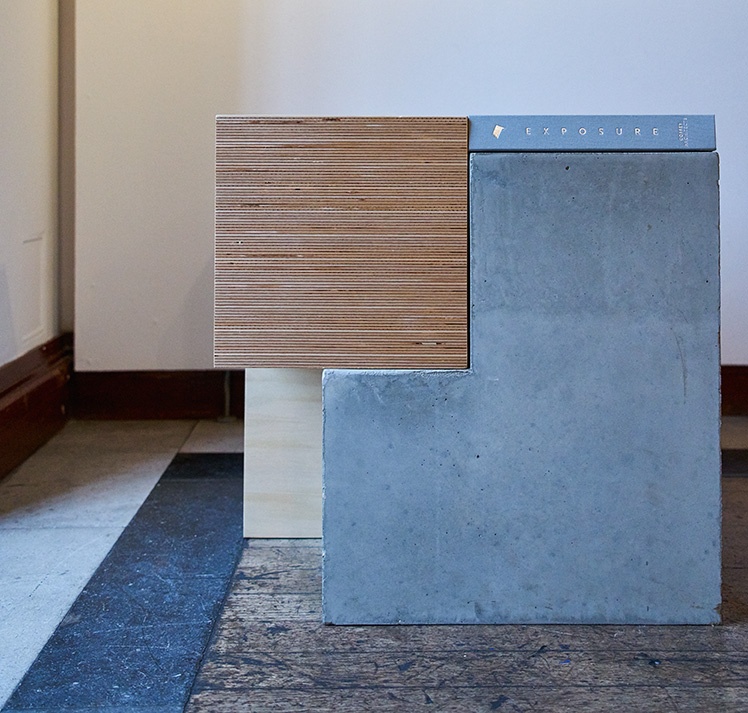
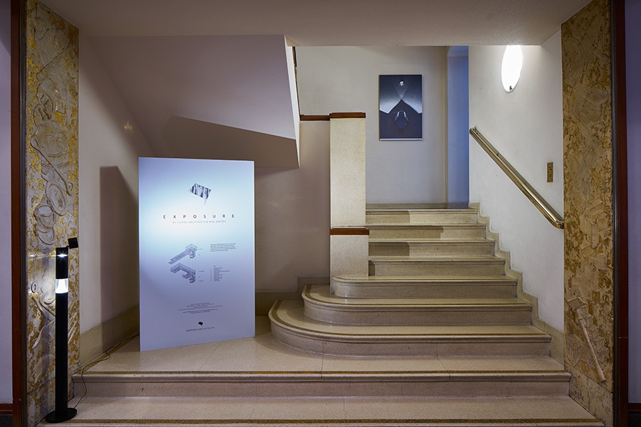
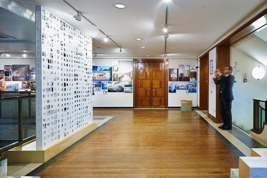
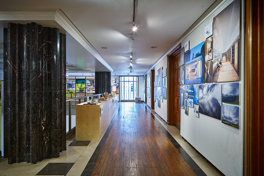
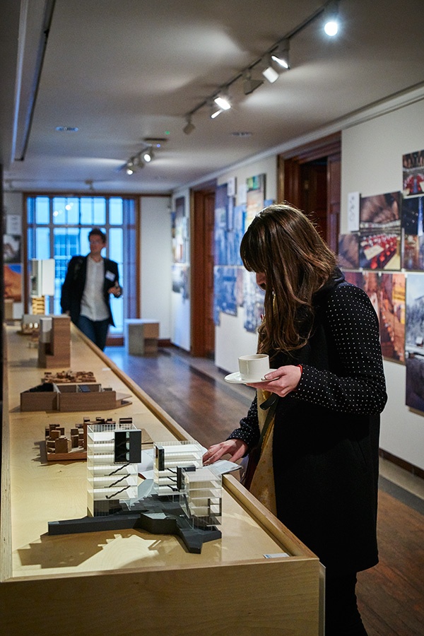
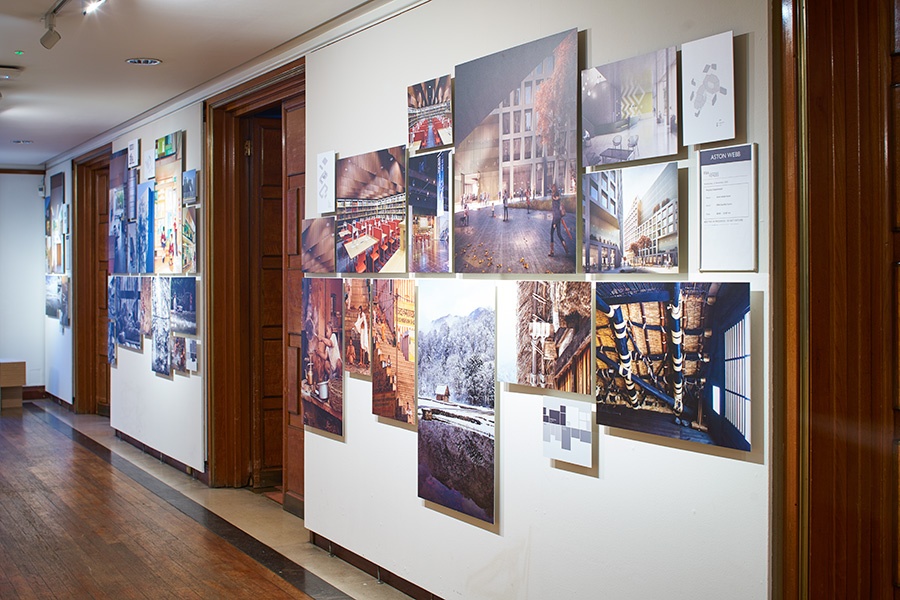
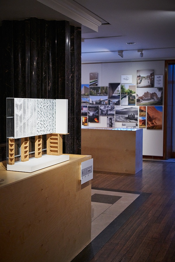
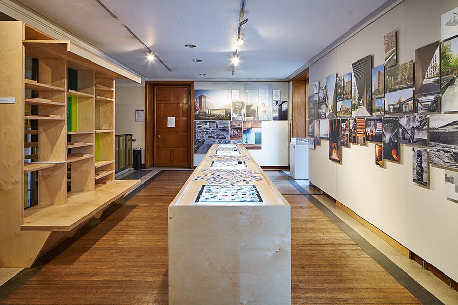
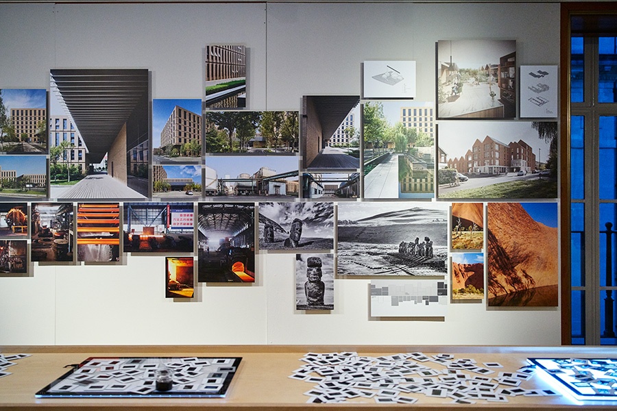
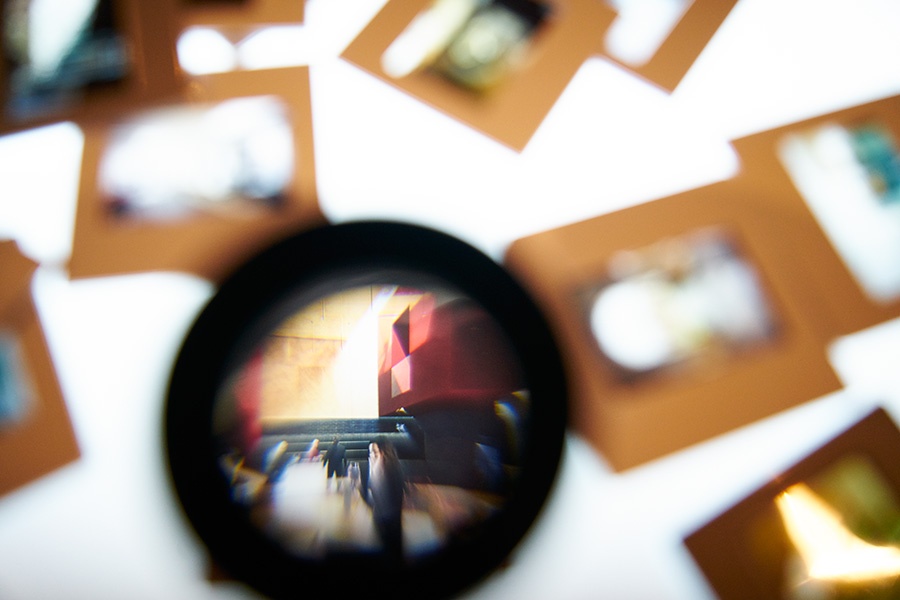
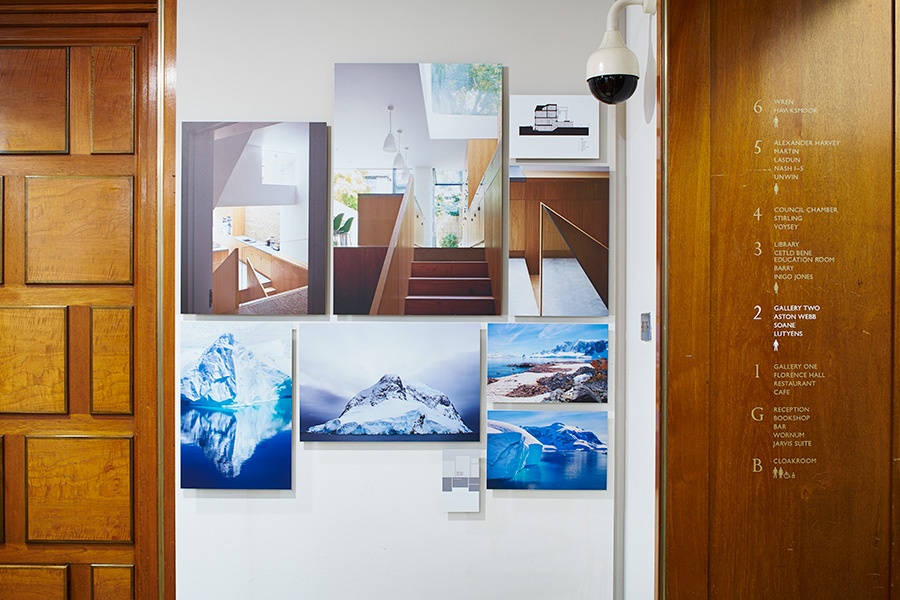
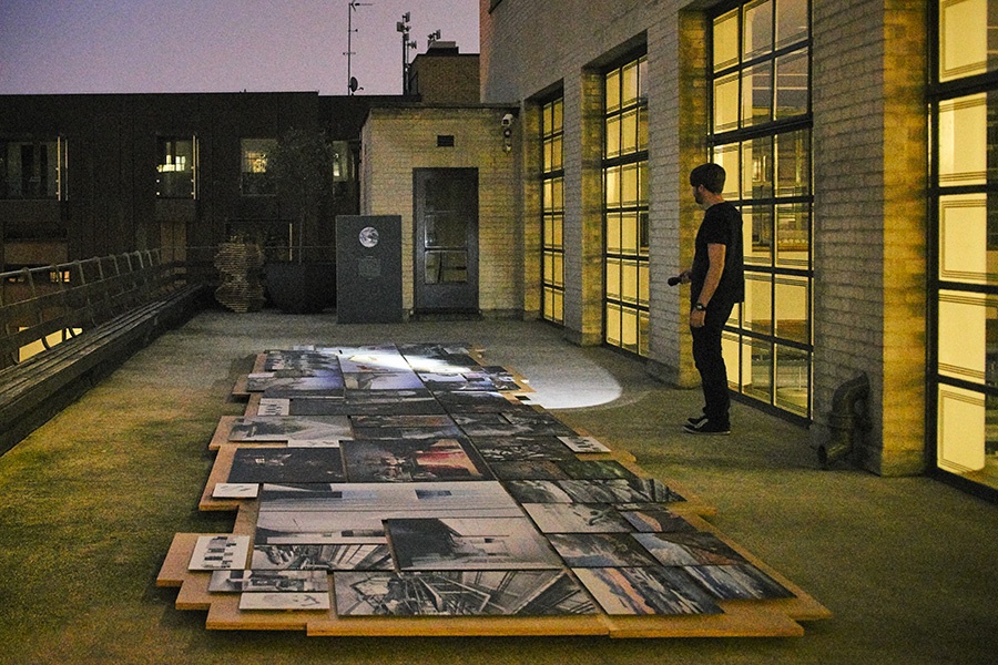
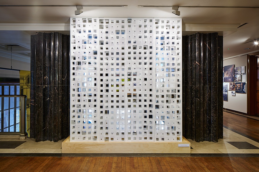
When I joined — the studio, founded in 2005 by Phil Coffey (quite curiously, another MacMag Editor in his student days), was celebrating its 10th anniversary. To celebrate this milestone, Phil had agreed to showcase the studio's work at the Royal Institute of British Architects' Headquarters — and asked me to help him design and organise the exhibition. The process of selecting, organising and laying out the images served as an amazing introduction to all the studio's projects. In addition to the work by Coffey Architects, the exhibition also featured Phil's photography from all over the world — the source of inspiration and a point of reference for the sustainable thinking within the office. It was, as a result, a two-tier exhibition: on one level, not more than just a collection of beautiful images that could be enjoyed by anyone in a matter of 5 minutes; and on the other level a whole series of essays about space and light. It was an exhibition that could be enjoyed both casually and seriously — and with the added interactivity of light boxes and photo slides, as well as individual torches to explore after dark — it was in fact the antithesis of the traditional Architecture exhibition for just Architects where one's curiosity is often suffocated by countless texts, plans and lifeless white models. Striking the right balance between the architectural and photographic projects, between a serious and light-hearted approach was challenging yet exciting — the visitors' feedback seemed to acknowledge those efforts in full. To add to all the above, the exhibition was accompanied by the 'Exposure' publication — a coffee table book that sits perfectly within the Coffey table design:


Photo by Timothy Soar

Photo by Timothy Soar

Photo by Timothy Soar

Photo by Timothy Soar

Photo by Timothy Soar

Photo by Timothy Soar

Photo by Timothy Soar

Photo by Timothy Soar

Photo by Timothy Soar

Photo by Timothy Soar

Photo by Timothy Soar


Photo by Timothy Soar

Photo by Timothy Soar


Being part of the set-up team on site, at the RIBA Headquarters, was an experience in its own right — a legendary building where I had previously experienced some rather serious and somewhat intimidating interviews — it will now always be the place where I once paced around making sure that all the prints, plinths, mock-ups and models are set up correctly in a relatively short time. It was a good fun, and a uniquely fast design-to-realisation project. The exhibition lasted from October to November, and was then moved on to a gallery in Victoria.

Since then, I've been busy working on a number of projects that will not be realised as quickly, and have been trying to make the most of the bustling Architecture scene in London. Luckily, the Coffey Cultural Club and its tradition of organising a monthly office outing to an exhibition or lecture has been of great help: since I began, we've enjoyed the RIBA Jencks Award lecture by Herzog & de Meuron, the Royal Academy lectures by Farshid Moussavi as well as Wang Shu and Lu Wenyu, the Sheila O'Donnell and John Tuomey Stephen Lawrence Memorial Lecture, and the Royal Gold Medal lecture by Zaha Hadid — the last one just a few weeks before her untimely passing.

In March, the studio produced quite a buzz at the Architect of the Year Awards — while the majority of the other offices were only represented by their directors, the Coffey team turned up in full — producing quite the cheer when our two nominations were read out. For a moment, Stephen Fry — the host of the evening — was even tempted to give us an award for this outstanding level of engagement, which totally made up for the fact we did not actually win on this occasion.

The other highlight was the studio trip to Venice. Led by our in-house Venice expert Andrea, the visit was incredibly enjoyable and stimulating — and because it's impossible to see everything in one go, we all still have a custom-made map with notes such as 'check out the details of the porch of this building' and 'best gelato' for future visits. The combination of the Biennale and the city was at times overwhelming, but the frequent cichetti and gelato stops powered us until late in the night, with the cool of the hotel's swimming pool providing a welcome relief to the September heat. Hardly anyone was awake on the way back — we landed on Sunday night, and on Monday morning the office was back to business as usual.

All in all, it's been a busy and intensive year since I moved to London — and everything's only picking up.


How much does an Architecture student work?


     Anyone who has ever met an Architecture student will have heard them complain (or brag?) about the long hours spent in studio, about the lack of sleep — about them working all the time. This has all been described, rather wittily, in a letter by Annie Choi

At the beginning of the Thesis year, I decided to find out how much an Architecture student really works — by recording my own progress during the final year of Architecture School. To do this, I used Toggl —  a simple time–tracker (developed in Estonia!) that allowed me to concentrate on my work and find out how long I spent on each task. I decided to record the time doing active work only — all the discussions, lunches, critical self–reflection, ping–pong matches in studio were omitted to reveal the time being productive — which in turn made me more conscious, and, I hope, more efficient at using this precious resource.

The result — 2535 hours of active work — is split by week in the following chart: 


With the majority of the academic work taking place over a period of 33 weeks, the average weekly workload was then a bit less than 77 hours — which translates to an average of 11 hours of active work per day, including all the holidays, week–ends and days recovering after all–nighters. Ouch. 

To be fair, not all of this time was spent on academic projects — part–time work, side projects and website management were also included in this record; however all in all this made up an intensive, exhausting year — with little time to spare for anything else. This is why my original ambition of sharing the Thesis development online proved rather unrealistic, and this is why it's probably just better to check out the finished project that consumed all 2535 hours here


Pecha Kucha Thesis


     Last week, Stage 5 students at the Mac could be seen attempting to sum up their Thesis research / thoughts since October in a series of 2 minute presentations. This experiment, based on the principles behind Pecha Kucha, was intended to challenge the traditional pin-up review format where several students present in separate rooms at the same time, without any real structure, with work that is not (at this stage) quite focused. Instead, the chosen format of 6 slides, each no longer than 20 seconds, was tested as a way to see the whole year’s work-in-progress in a concise, fast-paced and fun environment – even though the 2 minute presentations + 6 minute feedback, spread over 60+ people, still accumulated to a whole day of reviews. This ambitious experiment resulted in a very engaging and useful experience – we were finally able to see the work of all our peers, and were forced to really think about the essence of our design intentions this year. I, for one, found that it's far more difficult to break down some of the complex architectural themes into basic yet suggestive diagrams – so I tried to make that the aim of this presentation. Detailed and complex drawings will be the focus of the rest of the Thesis anyway.

The resulting 6-slide summary is a great way to show what I’ve been thinking since my last blog post, and to do it in a simple way – to cut straight to the chase: 


Journey. Intrigue. An Architecture that reveals & conceals. A Palace of Joy.


I believe that great Architecture is characterised by its ability to reinvent complex situations and turn them into elegant, seemingly effortless solutions. The external complexity appears as simplicity, revealing just a trace of how this has been done. This contradiction creates intrigue, a magical effect akin to a theater scrim which encourages further exploration and active participation. My Thesis explores this tension between complexity and simplicity, transparency and translucency, the act of revealing and concealing, the relation between the observers and the observed.

The incredibly charged, maze–like, layered station of Friedrichstraße — the major transport and culture hub of Berlin — provides a rich and stimulating context for a radical intervention that will transform and heighten the atmosphere of the area. I propose to counter the negative emotions associated with the adjacent Palace of Tears by proposing a Palace of Joy, to offset the increasing speed of travel and commute by creating a ‘Slow Travel’ alternative, to take on the negative impact of the recent developments and improve the public space performance within the area.

I propose to create a Hot Air Balloon Centre adjacent to — and suspended over — the existing train station. The balloons will serve as both the end purpose, and the inspiration for the proposed building. The Architecture will provide the feeling of wonder, joy and adventure — just like the hot air balloon journey that it serves to create.


Slide 1. The 1956 fantasy featurette directed by French filmmaker Albert Lamorisse follows the adventures of a young boy who befriends a large red balloon with a mind of its own. The two are seen exploring the city and its various conditions, drawing inquisitive looks from adults and the envy of other children. Almost no dialogue is required to tell the story; the balloon and the backdrop of the city are enough to create a universal set of meanings and powerful emotions: joy of discovery, wonder, fascination with simple phenomena, new perspective on the mundane.

My Architectural Design Thesis will attempt to re-create similar emotions, to add some 'fun' to the heavily charged area of the Friedrichstraße station.


2. The proposal examines the benefits of 'slow travel', of getting lost, of taking the time to go on explorations rather than going from A to B in the quickest way possible — because taking your time is the only way to discover something new, and to enjoy what the city has to offer. It's an antithesis to 'fast' travel, placed in the busiest transport knot in Berlin.


3. Instead of revealing everything right away, the project uses translucency to suggest, to tease the imagination — to break the mundane experience and hint at what's possible instead of simply showing things exactly as they are. It's an architectural expression of wonder, a reason to start the journey of exploration.


4. The proposal creates a counter-balance to the Palace of Tears, and aims to cater for the opposite emotions. The architecture of the Palace of Tears is examined and abstracted, with an opposite set of architectural devices forming the base for the Palace of Joy: for example, one will move up instead of going down, etc.


5. This diagram hints at the architectural organisation of the Thesis Design — the final section will, of course, evolve throughout the year, although I suspect it will always be easy to trace it down to this original idea of a 'hovering' building that creates a new set of relationships in this complex site.


6. Finally, this photograph from the 1909 Air Show at the Grand Palais, by Léon Gimpel, demonstrates the kind of Architecture that used to host hot air balloons. Keep an eye on this blog to see what (I think) hot air balloon architecture could look like today! 


Thesis site: 3D model


     I believe that great Architecture must be anchored within context. This is why, in addition to understanding the history of the site, I have been busy creating an up to date, precise 3D-model of the existing environment — a foundation on which I will be able to build throughout the year.

In case of the Friedrichstraße station, which has been patched up and altered on multiple occasions, the task of 3D-modelling was not as easy as simply building up from the 2D CAD drawing — it turned out to be an investigation into the organisational logic of this maze–like structure and resulted in a lot of questions that have already started informing my Thesis exploration. In fact, obtaining an up to date CAD file of the area turned out to be a challenge in itself — in Berlin, new structures are erected so quickly that almost every record of the site gets outdated within a couple years. As a result of all this, and simply because of the complex and multi-level nature of the site, I have invested around 117 hours into this 3D model – and every bit of it has been worthwhile.

Comparing all the CAD drawings, photos and videos, Google and Bing maps, shop diagrams as well as extracted Google Earth reference files — and piecing it all together into a single 3D model has already resulted in a detailed understanding and the ability to ‘see’ every aspect of the context; I now also have a digital copy of the area that I can test, add to, cut and render in any way imaginable — so watch out for future drawings based on this monster! 

For now, here’s some screenshots of the Rhino model in progress:


Thesis site: Bahnhof Friedrichstraße


     The final, fifth year of Architecture School is basically a chance to go wild and make the most of being a student without any real clients or constraints. At the Mac, the Final Thesis project is normally located within a European City of the student’s choice, resulting in an in-depth study and ambitious proposal that challenges the current condition.

For this, it is obviously essential to have a really good understanding of the city – so I had originally hoped to put my skills to test in my hometown of Tallinn. Having been away for several years, especially after the recent work experience in NYC and Beijing, I thought I could combine a fresh look from the outside with an insider’s perspective.

Alas, the city for our Thesis projects had been pre-selected this year, so I found myself and all my classmates exploring Berlin instead. For a week, one could spot a GSofA Architecture student in virtually every corner of Berlin: we criss-crossed all the streets in our areas of choice; took infinite amounts of site photos; puzzled the locals by being extremely interested in some very specific things they never even noticed; and found our ways into the most private locations just to get a better understanding of how this city works.

Then, the research continued online. It’s incredible how much specific information can be found on the internet, and how it’s possible to re-create the history of a specific site in Berlin all the way from Glasgow, simply by knowing where to look.

I, for one, have been obsessed with studying the development of the Friedrichstraße station and its surroundings, with a wealth of old maps, photographs and drawings helping me build an understanding of its complex history and importance throughout the various stages of Berlin’s history. Some of my favourite finds can be seen below:


The station today
Around 1900
1910
2014
1885
Johannes Vollmer, 1885
1898
1906-1908
1920
1950
1951
1957
1960s
1987
10 Nov 1989
2014


In addition to being a significant transport / culture hub at all times, the Friedrichstraße station has also played a curious role during the period of the divided Berlin: located entirely in East Berlin, it continued to serve trains and the subways from the West as well, and was in fact a major border crossing between the opposing regimes – an odd three-dimensional structure where the different worlds were effectively layered on top of each other. Today, exactly 25 years after the fall of the Berlin wall, it is hard to believe – the only obvious remnant from the time is the structure of Tränenpalast (‘Palace of Tears’) where Berliners from either side said their tearful goodbyes. In 2014, the Friedrichstraße station is instead the city’s busiest point of connection – a key intersection between subway lines, trams, ferries, buses, raised railway lines as well as the major shopping / leisure street.

In terms of context, there could hardly be a site more charged and complex than this. Watch out for future blog posts to see my Final Thesis develop within this urban knot!


New Website


     It has been almost 4 years since I launched my first ‘Arsenit’ website ­­— in this time, it has seen over 100,000 page views, has evolved with the addition of the blog and the latest studio projects, and has grown to be a place where I share my architectural journey ­­— even if finding the time to do so regularly might not have always been easy. 

I have developed a lot in this short time. The web has also matured, providing tools that allow to share much more effectively than before. With all this, the time has come for a new, re–imagined website that I am now proud to present. 

The WORK section has evolved from a gallery of individual images to a digital equivalent of a pin–up ­­­— the most effective way of explaining an architectural project where plans, sections and perspectives are experienced simultaneously.

Click for screenshots of the old website


The ABOUT page now offers an at–a–glance overview of my progress up to date, with further links to social media platforms for those who want to connect. 

This BLOG has been simplified with the intention of becoming a platform for sharing my final year Thesis Design progress — watch out for regular updates on my last ever project in Architecture School! 

Above all, this website is a way to share my architectural thoughts and development ­­— receiving feedback on ways to improve is always appreciated, so if you have any suggestions please send them my way! Thanks!

And now, back to the Thesis!